Onboarding
Reducing onboarding drop-off rates by 80%
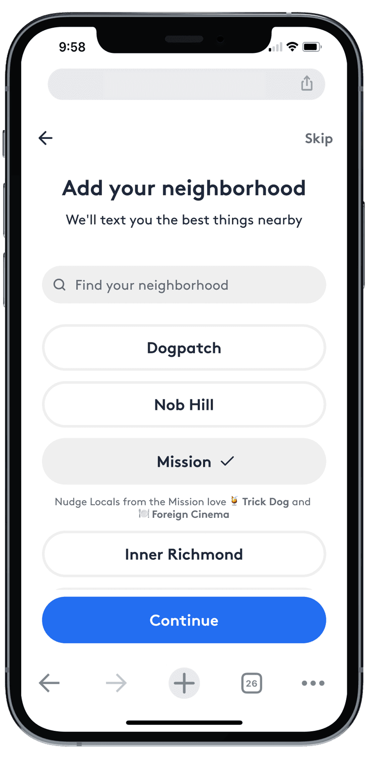
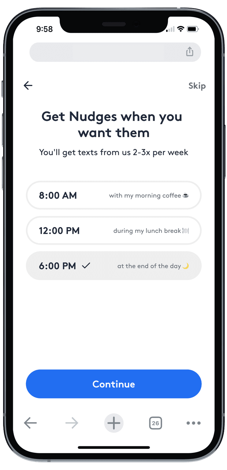
~14% of all sign-ups were failing to complete web onboarding.
Users who didn’t complete the sign-up process experienced a poorer product and showed lower rates of adopting our paid subscription.
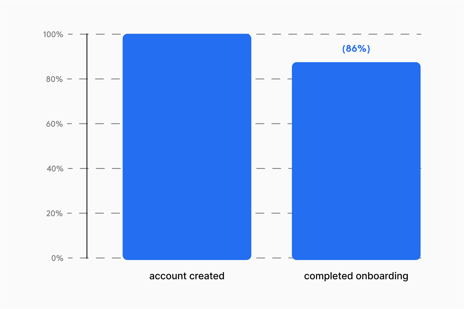
Data revealed that most users drop off at the final step which requires them to text us, activating our cost-saving messaging provider.
Unlike typical consumer apps, The Nudge is an iMessage-first product that sends users weekly texts about things to do in their city. While users technically create accounts by completing the first step of onboarding, they must send us a text as the final step to officially initiate Apple Business Chat, our cost-saving messaging provider.
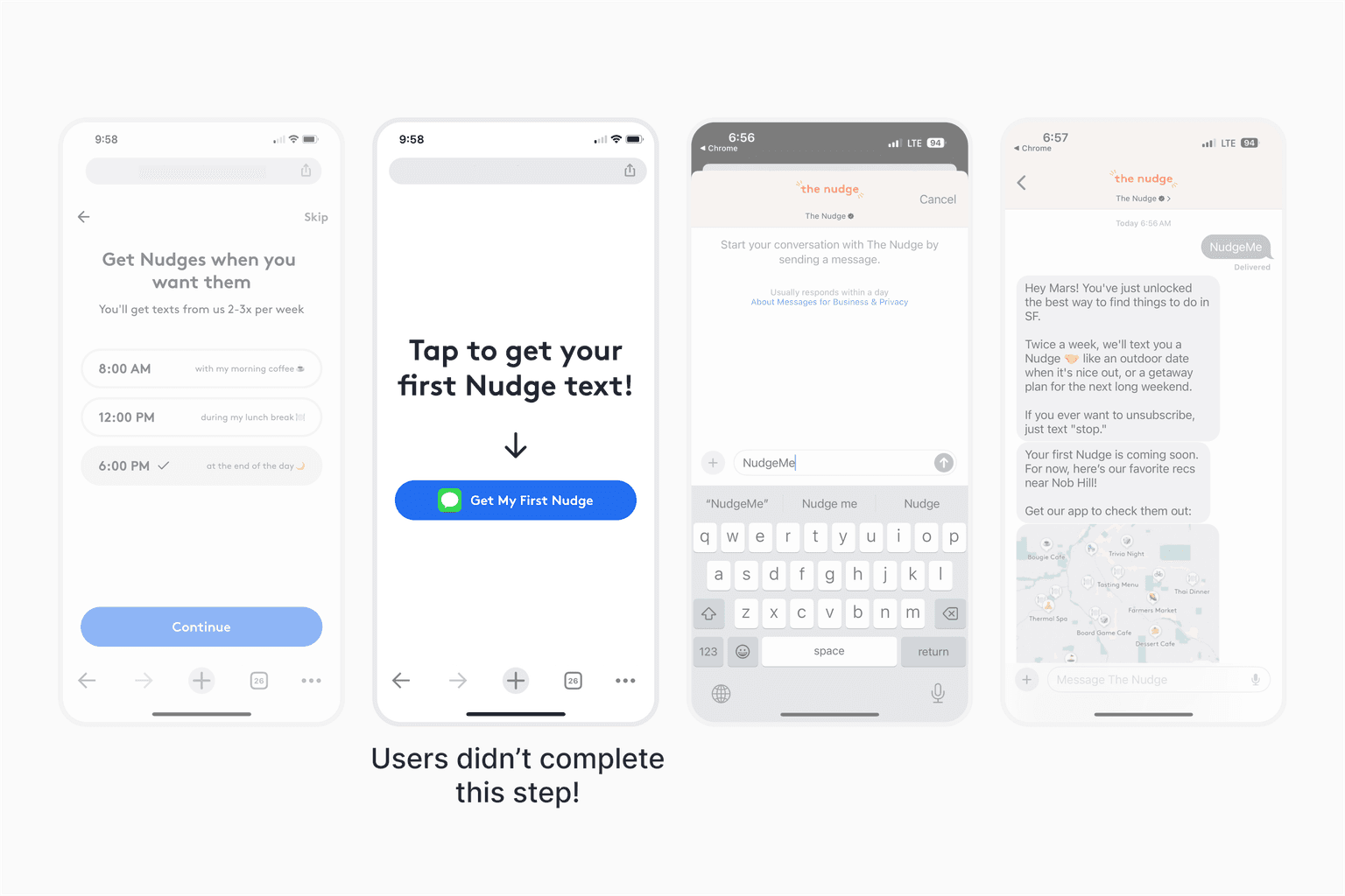
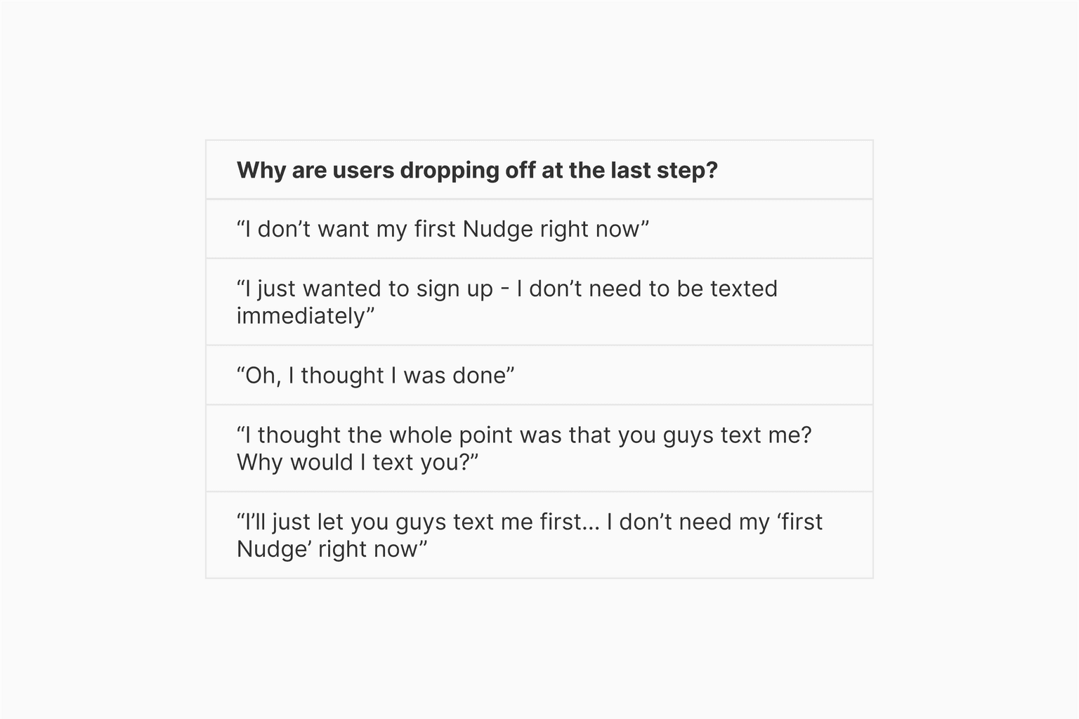
Usability testing showed people didn’t understand that this was a required step in completing sign up.
The novel experience of reaching out to a business first proved confusing for many users, leading to a significant drop-off at this step.
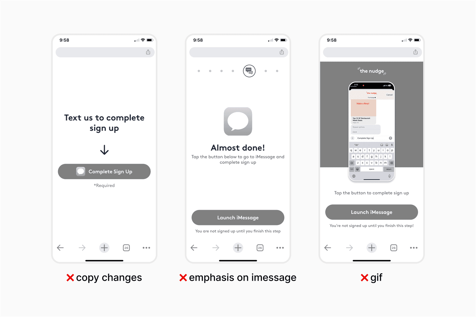
I explored several design directions aimed at encouraging users to complete this step, but none of them were quite landing right.
At first, the team expected a simple "required" flag or more clear copy changes to do the trick, so I explored a few different approaches that had varying degrees of handholding: from minor copy changes to GIFs demonstrating that onboarding wasn’t complete yet.
But encouraging this one user action turned out to be a surprising challenge.
I decided to take a step back to remind myself of the dream we were selling users during onboarding.
Understanding why users were signing up for The Nudge helped me come up with more appealing ways to position our last step of onboarding.
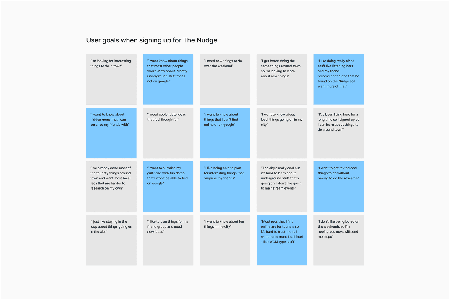
Users who sign up for The Nudge want to feel like they're joining an exclusive locals-only club.
Joining The Nudge means getting information about the coolest things to do in the city. It means more underground events, more plans with friends, more nights out.
Solution
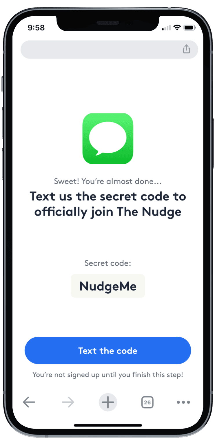
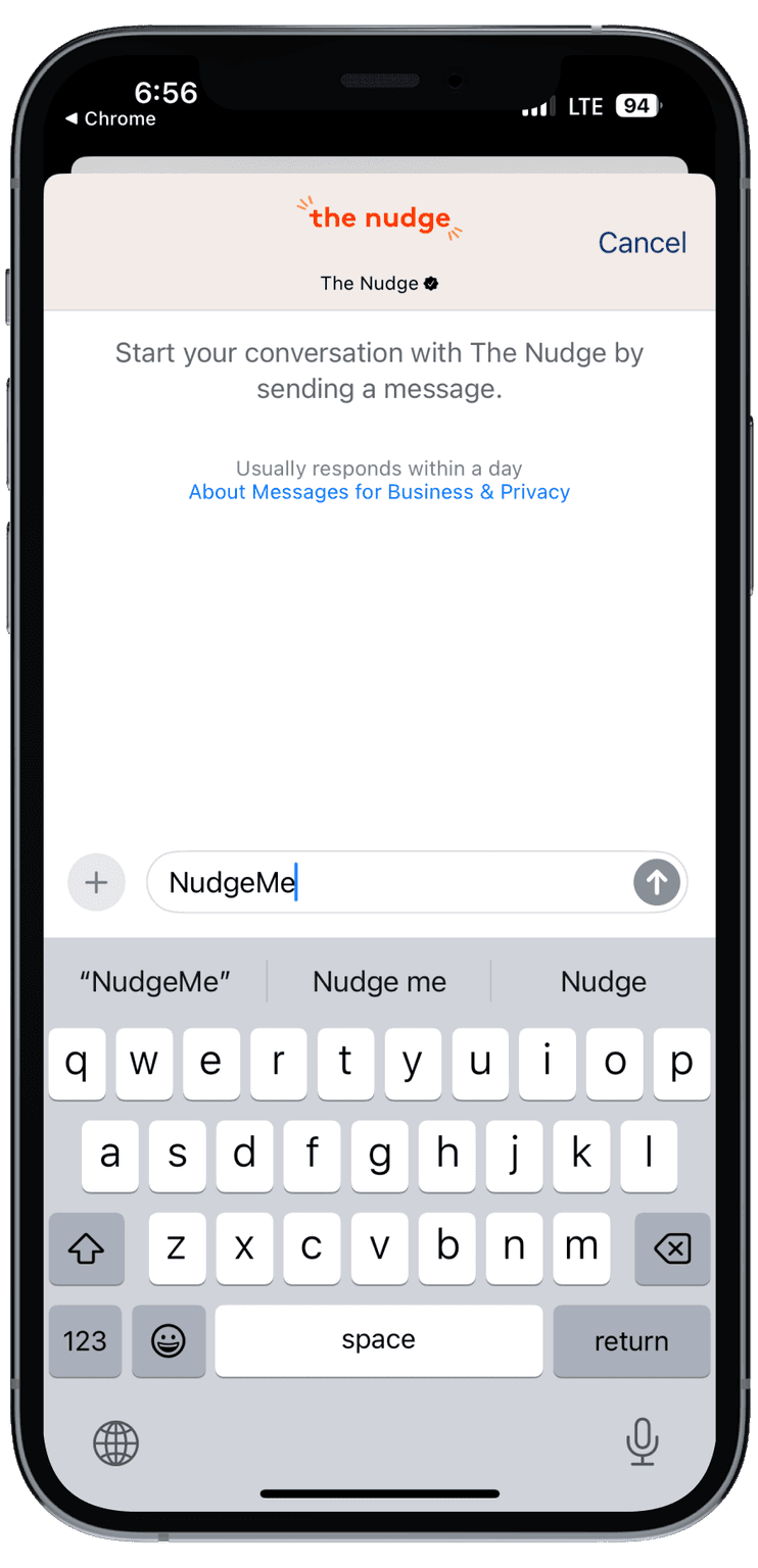
A "secret code" for users to text us to join The Nudge
This approach brought clarity to both the team and our users. The design shifted away from telling users what to do, to giving them a reason to text us that aligned with our brand.
- ✔️ clear that onboarding is not complete
- ✔️ CTA is simple to understand
- ✔️ users feel like they are joining an exclusive club
Results
Our solution helped users complete onboarding and adopt our cost-saving messaging provider
Additionally, users who completed sign up became 5x more likely to adopt our paid subscription & 2.5x more likely to adopt the app on D0.
The downstream effects of adopting our cost saving messaging provider during onboarding sent ripples throughout all of our company metrics.
Reflection
What seemed like a simple task initially, revealed itself to be more complex, and we ultimately arrived at an unexpected and creative solution.
This single screen reinforced the importance of thinking outside the box and demonstrated how impactful design can be when grounded in user insights. Seeing the ripple effect of this one screen in all of our KPIs was an eye-opening moment, and made me even more excited about the power of designing delightful user experiences.
Team
- Mars HovasseProduct Designer
- John PetersonCEO
- Kevin AveryCTO
- Jin KimEngineer