Written Plans
Designing LLM output that feels human
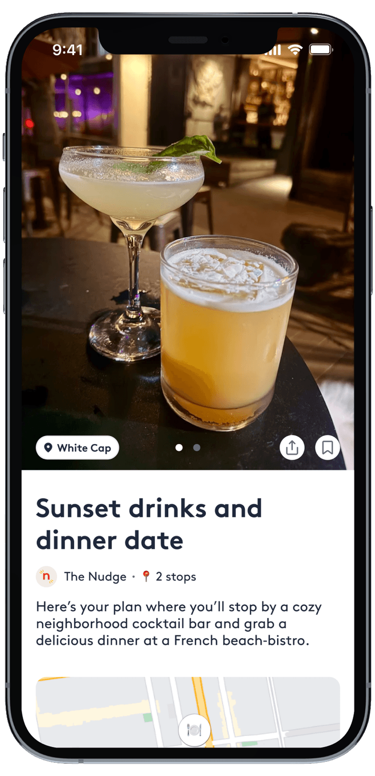
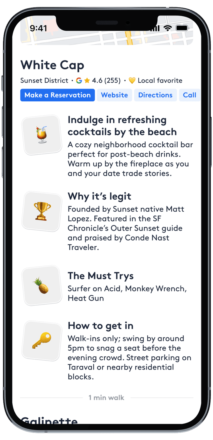
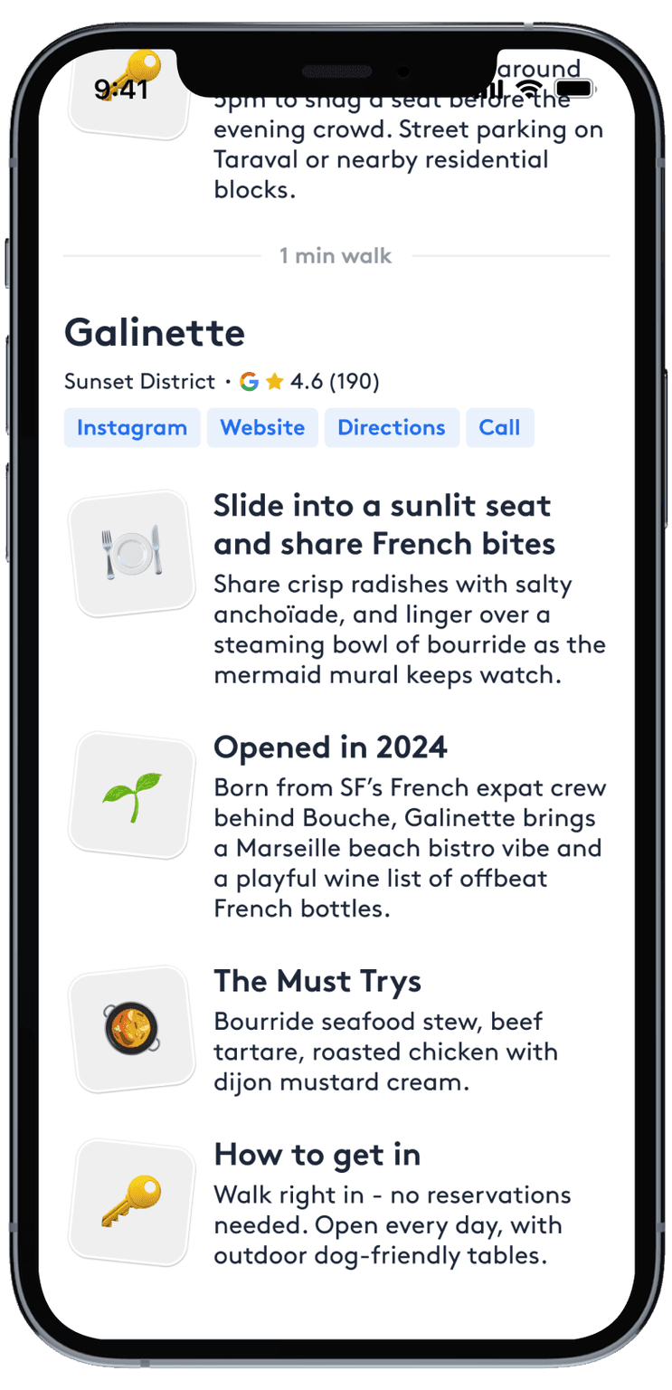
Our AI plan curator is strong at generating high-quality recommendations in text form, but LLM outputs don’t always translate to delightful product experiences.
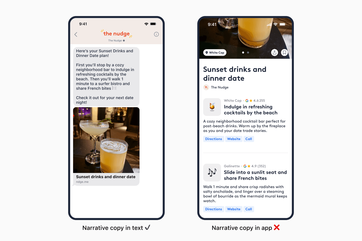
Summarizing our AI plan curator into an inspirational text was easy, but the same copy fell flat once brought into the app.
Our texts are intentionally written to spark intrigue. They’re designed to make someone feel like they’re about to have the best night of the week. In that context, the copy performs well.
But once a user views a plan in the app, their intent shifts.
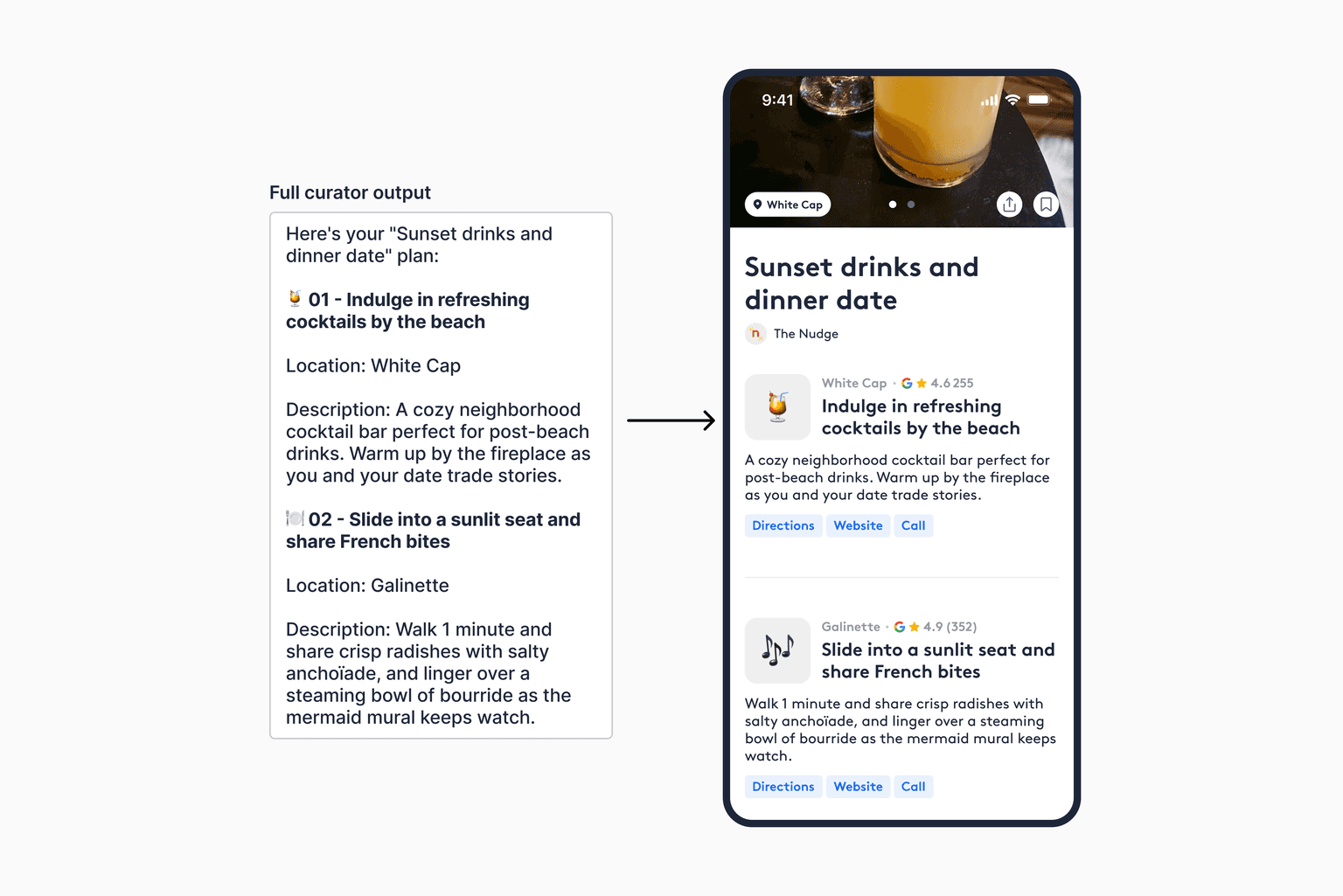
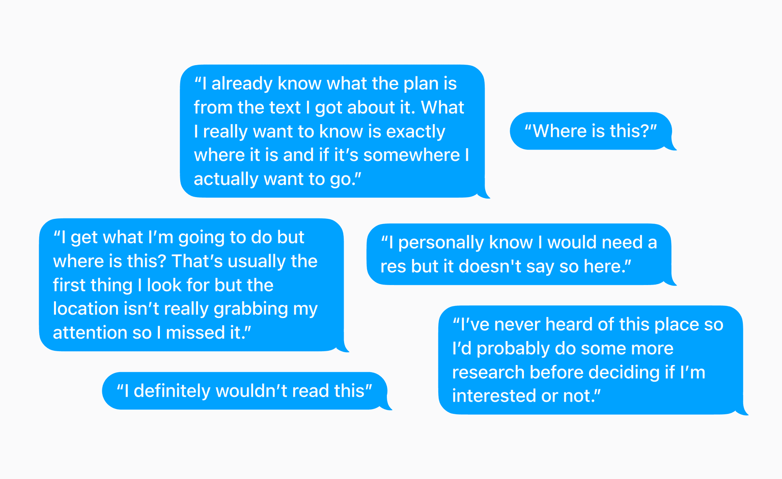
In user interviews, I saw a consistent pattern: people struggled to quickly parse plan details in the app.
The content felt more like a story than a tool. Instead of scanning for key information, users had to read through paragraphs to answer basic logistical questions.
And their first question wasn’t “what am I doing?” it was always “where is this, and can I actually get there?” The narrative format was hindering their ability to make decisions about the plan.
The same information needs to be framed differently depending on where the user is in their journey.
In a text, narrative works. We want to build intrigue and create desire. But in the app, that context changes. Users are no longer deciding if they want to go, they’re figuring out how to go. That shift from inspiration to execution requires a fundamentally different way of presenting the same content.
How might we shape written content in an engaging and actionable way?
The challenge was how to present our written plans in a way that felt just as engaging as our video content all while being easy to parse and rich in practical detail.
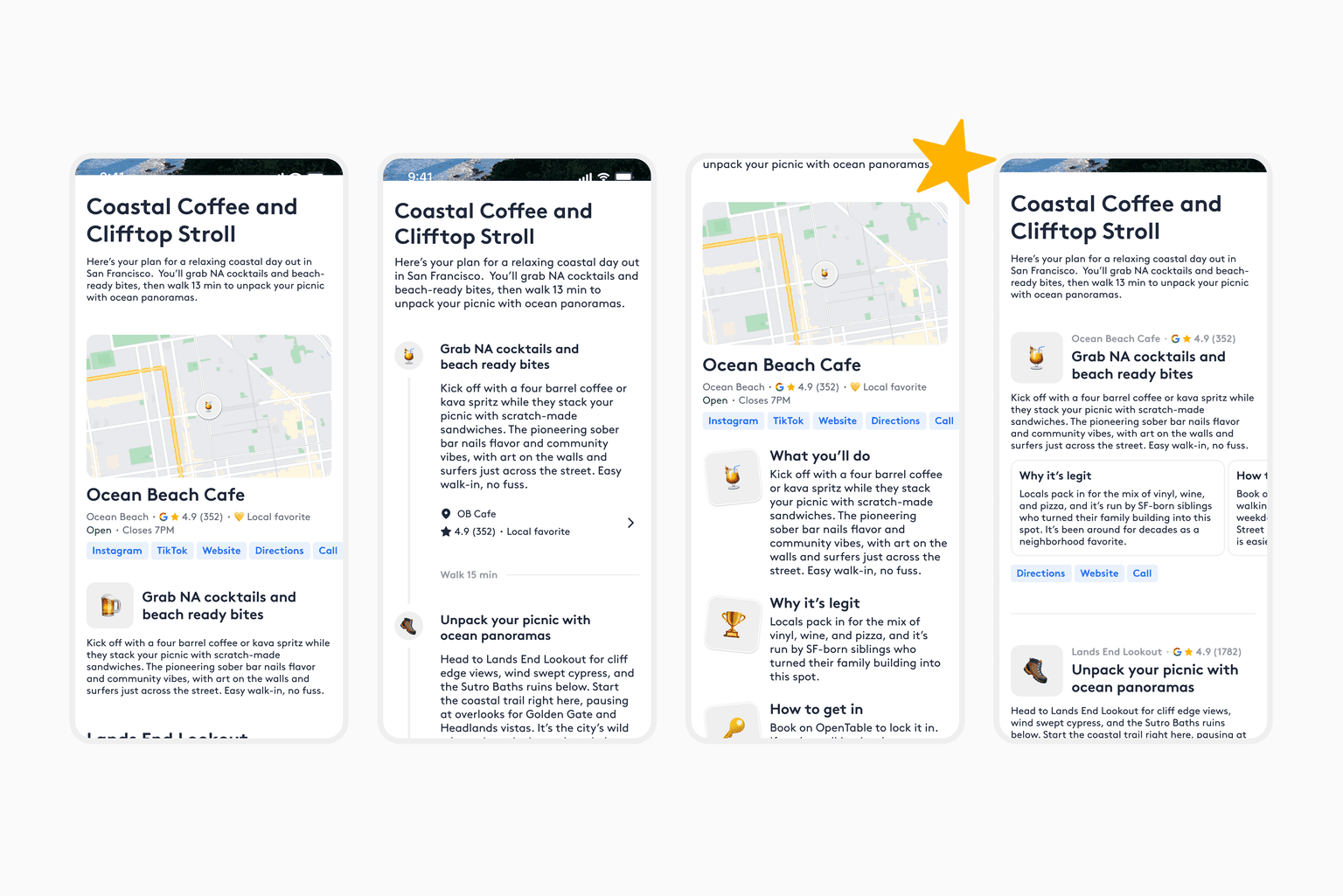
I tested multiple variations of the information hierarchy with users, focusing on how quickly they could understand what a plan was and what action to take next.
Across all sessions, one direction consistently emerged as the winner. Users responded most strongly to this layout, describing it as the clearest and most effortless to scan. In this version, the next step was immediately obvious, whether that was sharing with a friend, making a reservation, or deciding that they’re not interested. Users could move directly from understanding the plan to making a decision.
Solution
The redesign shifted the plan experience from story consumption to execution clarity
- ✔️ easy to scan
- ✔️ immediately orient information around location
- ✔️ AI place modules help users make decisions faster
Reflection
This project reinforced how much information hierarchy matters and how good design can remove cognitive overload for users and lead them to make faster decisions. Breaking content out into clear chunks helps guide users through the plans, and I saw that consistently across users.
Many interviewees also mentioned preferring our written content over our video content because it was easier to parse and felt that these screens were more shareable than some of our video content.
I’m excited to dig into the metrics of these design changes to see how it moves the needle for our app engagement.
Team
- Mars HovasseProduct Designer
- Chris SullivanSenior Engineer
- Ary TummalapalliSenior Engineer
- Fynn BuesnelEngineering Intern